Still creating boring event websites? Play with fonts!
Fonts for event websites? Is that really important? Yes, it is. Read below to find out why and how best to approach them.
Are you organizing a (online) business conference, or is your organization's corporate identity rather professional? Then the look and feel of your event website should naturally reflect that. Conversely, the same applies: for a festival-themed event, an anniversary, or another festive occasion, the atmosphere should be reflected in your event communications. In a previous blog post, we discussed web design trends ; in this one, I'll explain the importance of fonts—and provide some interesting examples.
Use different fonts for event sites
The most important thing is that visitors to your event website can easily read the information. If you consistently use the Roboto font, you're guaranteed to achieve this. But do important information, headings, and calls to action stand out sufficiently if the font is the same as the paragraph text?
Assume no one reads the carefully crafted text on your event website in its entirety. Your guests scan the page, and you grab their attention by using images or... a different font.
Away with boring fonts!
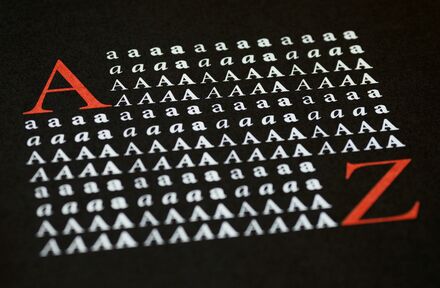
Maybe Roboto doesn't ring a bell, but you see it every day. It's the most commonly used font, and I understand why. The font has a business-like feel, which is true for all commonly used fonts. Business-like, but a bit dull.
Now that you know Roboto is the most commonly used font, will your event communication still stand out? Should you still use corporate fonts? Yes, because fonts like Roboto, Open Sans, and Lato ensure your message comes across well (on any device). But try using a different font for headers, so your event website instantly has a completely different look, your message stands out even more, and the look and feel (better) matches the type of event you're organizing.
Examples
Using different fonts for event websites is easier said than done, but which font should you choose? This demo website combines Playfair Display with Average as the header. There you have it: two unique fonts that still give the event website a professional look. Or try one of these combinations:
- Oswald + Raleway
- Oxygen + Ubuntu
- Lora + Poppins
- Amaranth + Source Sans Pro
Tip: Search Google Fonts for a font and check out the "pairings" – suggested combinations of two fonts.
Which combination will you choose? Share it with us at hello@halito.com or send us a message on Facebook.
nl
Lettertypes voor event sites? Is dat echt belangrijk? Ja hoor. Lees hieronder waarom dat zo is en hoe je het best aanpakt.
Organiseer je een (online) zakelijk congres of is de huisstijl van jouw organisatie vrij zakelijk? Dan sluit de look & feel van jouw event website daar natuurlijk op aan. Omgekeerd geldt hetzelfde: bij een event in festivalsfeer, een jubileum of ander feestelijk event moet de sfeer worden doorgetrokken in jouw event communicatie. In een eerder blog-artikel schreven we over de trends in webdesign; in dit artikel licht ik het belang van lettertypes toe – en geef ik een aantal leuke voorbeelden.
Gebruik verschillende lettertypes voor event sites
Het belangrijkste is dat bezoekers van jouw event website de informatie goed kunnen lezen. Gebruik je consequent het lettertype Roboto, dan is dat gegarandeerd het geval. Maar vallen belangrijke informatie, kopteksten en call-to-actions wel voldoende op als dat lettertype gelijk is aan dat van de paragraaf-tekst?
Ga er vanuit dat niemand de zorgvuldig opgestelde tekst op jouw event website volledig leest. Jouw genodigden scannen de pagina en je trekt hun aandacht door gebruik te maken van afbeeldingen of… een ander lettertype.
Weg met saaie lettertypes!
Misschien zegt Roboto je niks, maar je komt het dagelijks tegen. Roboto is namelijk het meest gebruikte lettertype en dat begrijp ik wel. Het lettertype heeft een zakelijke uitstraling en dat geldt eigenlijk voor alle veelgebruikte lettertypes. Zakelijk, maar een tikkeltje saai.
Nu je weet dat Roboto het meest gebruikte lettertype is, valt jouw event communicatie dan nog wel op? Moet je nog wel zakelijk lettertypes blijven gebruiken? Ja, want lettertypes als Roboto, Open Sans en Lato zorgen ervoor dat jouw boodschap (op ieder device) goed over komt. Maar gebruik eens een ander lettertype voor kopteksten, zodat jouw event website direct een heel andere uitstraling krijgt, jouw boodschap des te meer opvalt en de look & feel (beter) aansluit bij het type event dat je organiseert.
Voorbeelden
Andere lettertypes voor event sites gebruiken, is makkelijker gezegd dan gedaan, want welk lettertype kies je? Op deze demo-website is Playfair Display als koptekst gecombineerd met Average. Zo zie je: twee uniekere lettertypes die de event website toch een zakelijke uitstraling geven. Of probeer eens één van deze combinaties:
- Oswald + Raleway
- Oxygen + Ubuntu
- Lora + Poppins
- Amaranth + Source Sans Pro
Tip: zoek op Google Fonts naar een lettertype en kijk eens bij ‘pairings’ – voorgestelde combinaties van twee lettertypes.
Welke combinatie kies jij? Deel het met ons via hello@halito.com of stuur een berichtje via Facebook.